We build and run websites for dozens of apartment communities. Over time the same mistakes kept showing up, so we wrote a standard. Every site we ship is checked against it, and the person who signs off judges it the way a renter would: by clicking around, on a phone, with no explanation.
Here it is.
1. Before anything else: save what already exists
When an old site is replaced, things that took years to earn can vanish with it. On one rebuild, the community had 84 verified resident reviews on a third-party resident-experience platform. The property was about to move to new software, and those reviews would have disappeared. Nobody had listed them.
So every rebuild now starts with an inventory of verified assets outside the new site:
- Reviews on resident-feedback platforms and on the Google Business Profile
- Listings on rental portals and the property management software's own listing pages
- Awards, photo and video libraries, floor plan files, fee sheets
We capture reviews exactly as written, with the reviewer's first name or initial, date and rating, and we never edit the wording. Before handover, the owner gets a short list: found, used, missing.
2. Write for renters, never for the industry
An apartment website exists for one reader: someone deciding where to live. Every page and blog post uses one of two lenses:
- The neighborhood: commutes, food, parks, events, what it's like to move to the city.
- The building: floor plans, amenities, parking, pets, specials, affordability programs, availability.
Leasing tactics, marketing advice and property management industry topics never appear, however good they'd be for the management company's own site. And every post names the building early and ends with a way to see it: a tour, live availability, or a phone number. What happened when we published 30 posts this way on three buildings.
3. Photos carry the site
- Big, bright photos of the real building and units. No dark tint laid over a photo to make the text readable; put the text somewhere else.
- No captions under every photo. Photo credits go on one credits page.
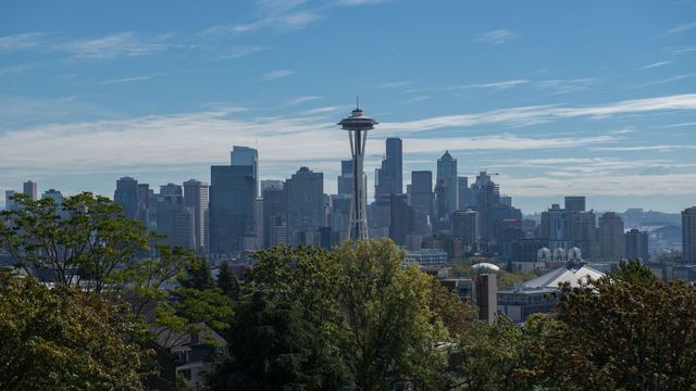
- Lots of images is fine, as long as each one is of this place. Generic stock photos of strangers in a kitchen tell a renter nothing.
4. Look like a real apartment site
Unusual layouts read as broken, not creative. The rules we've settled on:
- The community's name, big, with a light page and plain sans fonts. Always the full name with "Apartments" on the end.
- Each section has its own format, so the page has a rhythm, but no decorative patterns or ornaments.
- The whole card or photo is the link. No extra button that repeats the heading next to it, and no underlined links scattered through the content.
- One FAQ design across the site, as plain question rows. Not one huge question, and not five different styles on one page.
- A long menu is one column. Short footer columns are fine; a three-column menu is not.
- A balanced footer, with no tall single list on one side and empty space on the other.
5. The map shows real places
A neighborhood map earns its space only if it's useful:
- Pins are category icons (coffee, groceries, parks, transit), never numbers.
- Clicking a place shows its photo and the walking or driving time from the building, not just a name.
6. Availability and prices are live
Renters want to know what's open and what it costs before they call. Pull current availability and pricing from the property management software rather than typing them into the site, where they go out of date within a week.
7. Fair housing wording
Describe the property and the neighborhood, never the people you'd like as residents. "Two blocks from the light rail" is a fact about the building. Phrases that describe an ideal resident can run into fair housing rules, so they don't appear on our sites.
8. Check it like a renter, on a phone
Before sign-off we click everything at desktop and phone width, as a stranger would: every menu item, every card, every map pin, the tour form. Then we say plainly what wasn't tested. Sites that look alike, or that break on an inner page nobody opened, are what cost a property owner's trust.